
To pick palettes like a pro, start by understanding the color wheel and its schemes. Use complementary colors for bold contrasts, analogous shades for harmony, and triadic combos for balance. Think about the mood you want—calm or energetic—and choose colors that support that feeling. Practice experimenting with fabric samples and trust your eye to create cohesive, vibrant designs. Keep exploring these principles, and you’ll soon find your perfect quilting palette effortlessly.
Key Takeaways
- Use the color wheel to select schemes like analogous, complementary, or triadic for balanced and vibrant palettes.
- Consider your quilt’s mood or theme to choose colors that evoke the desired emotion or atmosphere.
- Practice creating small fabric palettes to develop your intuition and confidence in color harmony.
- Balance high contrast and soft tones to achieve visual interest without overwhelming the design.
- Experiment with mixing schemes and shades to add depth, personality, and cohesion to your quilt projects.

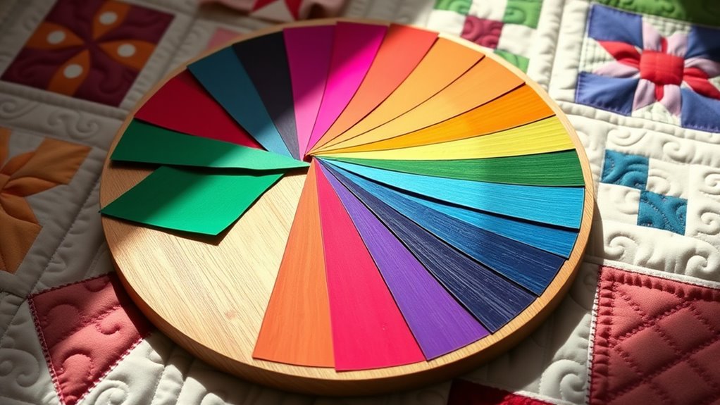
Have you ever wondered how to create quilts that are visually stunning and balanced? The secret lies in understanding the fundamentals of color theory, especially how to use the color wheel and color harmony to craft appealing palettes. When you familiarize yourself with the color wheel, you gain a powerful tool that helps you see how colors relate to one another. It’s a circle that displays primary, secondary, and tertiary colors, providing a visual map for selecting shades that work well together. Using this tool, you can develop a sense of which hues will complement or contrast with each other, making your quilting projects more cohesive and vibrant.
Color harmony is the key to creating pleasing color combinations. It refers to the way colors are combined so that they look balanced and intentional, rather than chaotic or jarring. For quilters, mastering color harmony means choosing palettes that enhance your design without overwhelming the eye. You might aim for analogous color schemes, where neighboring colors on the color wheel—like blue, teal, and green—create a serene, harmonious effect. Alternatively, complementary color schemes use colors directly opposite each other on the wheel, such as red and green, to produce a lively, dynamic contrast that energizes your quilt. Triadic schemes involve three colors evenly spaced around the wheel, offering a balanced yet vibrant palette that can add visual interest without feeling chaotic.
Master color harmony to create balanced, vibrant quilt designs with schemes like analogous, complementary, or triadic colors.
To pick a palette like a pro, you should consider the mood or theme you want to evoke. Do you want your quilt to feel calm and soothing? Choose analogous colors in soft tones. Looking for bold, energetic designs? Opt for complementary or triadic schemes with high contrast. Remember, you don’t have to stick strictly to one scheme—mixing and matching can add depth and personality to your quilt. The key is to maintain balance, ensuring that the colors don’t compete for attention but instead support each other. Using the color wheel as your guide, you can experiment with different harmony schemes until you find the perfect combination that aligns with your vision.
Ultimately, the goal is to develop an intuitive sense of which colors work well together, turning your color choices into a seamless part of your quilting process. Practice by creating small palettes and testing them out in your fabric selections. Over time, you’ll gain confidence in picking colors that make your quilts pop, all while maintaining a harmonious and balanced appearance. With a solid understanding of the color wheel and color harmony, you’ll be well on your way to designing quilts that are not only beautiful but also visually cohesive and enchanting.
Frequently Asked Questions
How Do I Choose Colors for a Specific Theme or Mood?
When choosing colors for a specific theme or mood, consider color symbolism to evoke the feelings you want. Think about how warm colors create energy and excitement, while cool tones promote calmness. Use contrast and harmony to enhance the mood further, and select a palette that aligns with your intended message. Trust your intuition, and don’t be afraid to experiment until your quilt visually captures the desired atmosphere.
Can Color Theory Help With Fabric Pattern Choices?
Imagine your fabric collection as a vibrant garden, each pattern a blooming flower. Color theory guides you to choose fabric patterns that create color harmony, making your quilt visually soothing or lively. By understanding how different patterns coordinate, you’ll select fabrics that complement or contrast beautifully. This helps you craft quilts with seamless fabric coordination, ensuring your chosen patterns enhance your design and evoke the mood or theme you desire.
How Do I Balance Bold and Subtle Colors in My Quilt?
To balance bold and subtle colors in your quilt, focus on creating color contrast to make bold hues stand out while using subtle tones to provide calm. Incorporate fabric harmony by pairing colors that complement each other, so your quilt feels cohesive. Mix large bold prints with softer, understated fabrics, ensuring the overall design remains balanced. This approach helps you achieve visual interest without overwhelming the viewer.
What Are Common Mistakes When Selecting Quilt Color Palettes?
Did you know 65% of quilters struggle with palette choices? A common mistake is causing color clash by mixing incompatible hues, which distracts from your design. Others overuse neutrals, making quilts dull or flat. To avoid these pitfalls, choose harmonious colors and balance bolds with subtle shades. Think about the mood you want and test your palette before stitching. This helps create cohesive, eye-catching quilts that truly shine.
How Do I Adapt Color Schemes for Different Quilting Styles?
When adapting color schemes for different quilting styles, focus on achieving color harmony that suits each style’s mood and design. You should consider fabric coordination, choosing colors that complement or contrast effectively. For traditional quilts, stick to classic color combinations, while modern styles may call for bold, unexpected palettes. Adjust your choices based on the overall aesthetic you want, ensuring your fabric selections work together seamlessly for a cohesive look.
Conclusion
By mastering color theory, you’ll open endless creative possibilities and transform your quilting projects into breathtaking masterpieces. With your newfound understanding, selecting palettes will become as effortless as breathing—and just as natural. Remember, the right colors can turn a simple quilt into a work of art that leaves everyone in awe. So trust your instincts, experiment boldly, and let your palette tell your unique story. Your quilting journey is about to reach dazzling new heights!