
To build a palette that works quickly, start by understanding key color principles like harmony, contrast, and psychology. Use the color wheel to pick complementary or analogous colors that blend well together. Apply simple tools like fabric swatches and digital apps for matching shades easily. Recognize common schemes like triadic or monochrome for different moods. If you keep these tips in mind, you’ll create cohesive and impactful designs in no time. Keep exploring to master your color choices.
Key Takeaways
- Use color harmony principles like analogous and complementary schemes to quickly create cohesive fabric palettes.
- Apply color psychology to select hues that evoke desired moods and enhance project impact.
- Utilize fabric swatches, color charts, and digital apps for fast, accurate color matching.
- Balance contrast and temperature (warm vs. cool) to ensure visual interest and emotional resonance.
- Group similar shades and create shade progressions for harmonious, polished sewist designs.

Newamishquilt 50 PCS 8" x 8" Precut Multi-Colors Cotton Fabric Squares Fabric Bundles for Sewing & Quilting Beginners
- Material: 100% cotton with sateen weave
- Quantity: 50 colorful fabric squares
- Size: 8 x 8 inches (20cm x 20cm)
As an affiliate, we earn on qualifying purchases.
As an affiliate, we earn on qualifying purchases.
Master Essential Color Theory Principles for Sewing

Understanding the fundamental principles of color theory is essential for creating harmonious and visually appealing sewing projects. By grasping concepts like color psychology, you can choose colors that evoke specific emotions or moods, enhancing your fabric choices. For example, warm colors like reds and oranges can energize a design, while cool tones like blues and greens create calmness. When fabric dyeing, understanding how dyes interact with fabric and each other helps you achieve consistent, vibrant colors. Mastering the color wheel, including complementary and analogous colors, ensures your project’s palette is balanced and cohesive. Additionally, knowing the contrast ratio between colors can help you create designs with visual impact and clarity. A strong understanding of color harmony techniques allows you to craft palettes that are both visually appealing and effective in communicating your intended message. Recognizing how precious metals like gold can serve as accents in design can add a luxurious touch and elevate the overall aesthetic. Incorporating natural inspiration from the environment can further enhance your color choices and make your creations more harmonious with their surroundings. With these principles, you can confidently select shades that not only look great together but also communicate the intended feeling or message through your sewing.
Quickly Pick Cohesive Color Palettes for Your Projects

Choosing a cohesive color palette doesn’t have to take hours. You can quickly create harmony by understanding color schemes and using helpful tools like color wheels or apps. These methods make it easier to pick colors that work beautifully together in your projects.
Harmonizing Color Schemes
Harmonizing color schemes allows you to create cohesive and visually appealing projects with ease. To achieve this, focus on effective color pairing and shade coordination. Start by selecting a dominant hue, then choose secondary colors that complement or contrast it thoughtfully. Using analogous colors creates a smooth, harmonious look, while complementary shades add vibrancy and energy. Shade coordination helps guarantee your colors work well together by considering lightness and saturation levels, preventing clashes. Pay attention to how different shades interact, balancing bold and subtle tones for visual interest. Understanding color harmony principles can further refine your choices, ensuring your palette feels intentional and balanced. By mastering these principles, you’ll develop a natural sense of harmony that simplifies your color choices and elevates your sewing projects, making them look polished and well-planned.
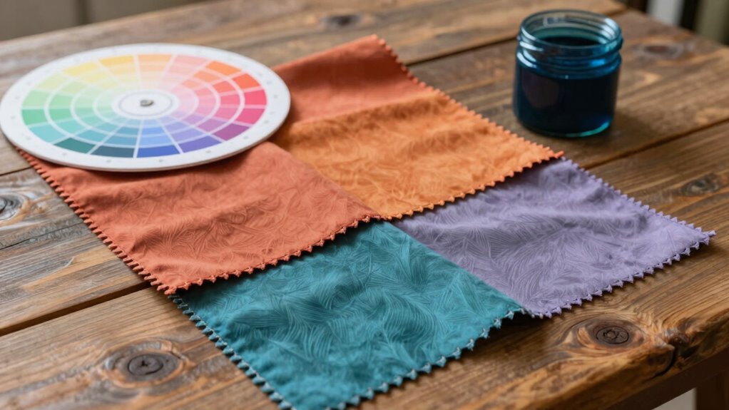
Using Color Tools
Using color tools can make selecting cohesive palettes quick and effortless, especially when you want to move beyond guesswork. Digital color matching apps allow you to identify shades instantly from photos or fabric samples, streamlining your decision process. Fabric color charts serve as reliable references, helping you see how colors look in real life and ensuring consistency. These tools enable you to experiment with different combinations without wasting time or materials. By using digital matching for inspiration and fabric charts for accuracy, you can confidently build a harmonious palette that works together. Incorporating these tools into your workflow simplifies choosing colors, saves time, and boosts your creativity, making your sewing projects more polished and professional. Additionally, understanding color theory helps you select combinations that evoke the desired mood or aesthetic. Recognizing color interactions can further enhance your ability to create visually appealing and balanced color schemes. Leveraging color harmony principles can also improve the overall cohesiveness of your projects. A solid grasp of color psychology can help you choose palettes that resonate emotionally with viewers and wearers alike. Exploring visual balance further refines your ability to create harmonious and aesthetically pleasing designs.
Use Easy Tools and Tips to Match Fabrics and Colors
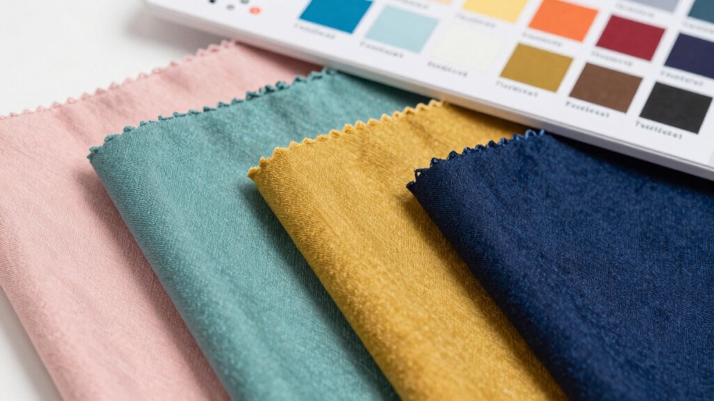
Matching fabrics and colors becomes much easier when you rely on simple tools and practical tips. Using fabric matching guides or color swatches helps you compare shades side-by-side, ensuring harmony in your project. Keep a small set of fabric swatches or digital color samples handy for quick reference. To deepen your understanding, consider this visual guide:
| Fabric Type | Color Compatibility | Tips for Matching |
|---|---|---|
| Cotton | Soft pastels | Use light backgrounds |
| Silk | Jewel tones | Contrast with neutrals |
| Wool | Earth tones | Layer for depth |
| Linen | Bright hues | Balance with subtle shades |
This approach simplifies decision-making, making your fabric matching more accurate and confident. Additionally, understanding the underlying principles of color theory can enhance your ability to create harmonious combinations and improve your overall skills, especially when you integrate color theory concepts into your fabric choices. Incorporating color harmony principles further refines your palette selection and elevates your sewing projects. Developing a foundation in color matching techniques helps you make more intuitive and aesthetically pleasing choices, even for complex color palettes. Becoming familiar with visual harmony concepts can also guide you in achieving balanced and appealing designs.
Learn the Most Common Color Schemes and When to Use Them

Have you ever wondered which color schemes make your sewing projects stand out or feel cohesive? Understanding the color wheel is key. Complementary schemes pair colors opposite each other on the wheel, creating vibrant contrast perfect for statement pieces. Analogous schemes use neighboring colors, offering harmony and a calming effect, ideal for subtle designs. Triadic schemes involve three evenly spaced hues, balancing vibrancy with unity, great for lively projects. Keep color temperature in mind: warm colors like reds and oranges evoke energy, while cool colors like blues and greens feel calm. Recognizing these common schemes helps you decide when to use them, whether for bold or subtle effects. Mastering these strategies allows you to build striking, harmonious palettes for any sewing project. Additionally, understanding color harmony principles can greatly enhance your ability to create visually appealing and balanced designs. Being aware of wave and wind patterns can also inspire dynamic color combinations that mimic natural movement and energy.
Avoid Color Mistakes That Can Ruin Your Sewing Projects
While choosing appealing color schemes is important, overlooking common color mistakes can quickly undermine your sewing projects. One mistake is creating color clashes, where hues fight each other and distract from your design. To avoid this, stick to harmonious combinations and test swatches before sewing. Another pitfall is overusing hues, which can make your project appear dull or overwhelming. Limit the number of bold or bright colors to maintain balance and cohesion. Be cautious with similar shades that can blend into each other unintentionally, causing a murky look. Also, ignore the importance of context—colors that work in one setting might not in another. Additionally, understanding color harmony can help you select palettes that visually work well together, enhancing your project’s overall effect. Incorporating color psychology principles can further guide you in choosing colors that evoke the desired mood or message, preventing color mistakes that could ruin your project’s overall effect. Being aware of color contrast is essential to ensure your designs have enough visual separation for clarity and impact. Moreover, understanding how different personality traits influence color preferences can help tailor your palettes to suit your personal style or the message you want to convey. Recognizing the significance of color context can help you adapt your choices based on the environment or intended use of your sewing project.
Apply Your Color Skills to Sew More Cohesive and Beautiful Designs

You can make your sewing projects look more polished by harmonizing your color choices and using contrast wisely. When colors complement each other, your designs feel cohesive and intentional. Playing with contrast helps highlight details and adds visual interest to your creations. Incorporating passive voice detection into your editing process can further enhance clarity and engagement in your writing. Additionally, understanding color harmony can guide you in selecting palettes that naturally work well together. Exploring essential oils for mood enhancement can inspire your color selections by integrating vibrant or calming hues to match your project’s mood. To elevate your color skills, considering the color theory behind your choices can help you create balanced and aesthetically pleasing designs.
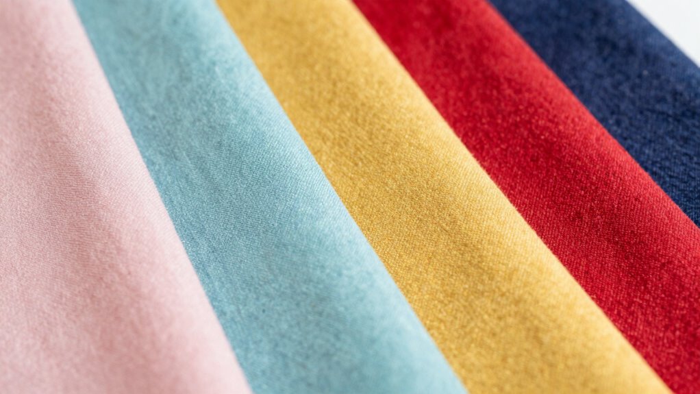
Harmonize Your Color Choices
Harmonizing your color choices transforms random fabrics into cohesive, visually appealing designs. You achieve this through effective color balancing and shade matching, ensuring each fabric complements the others. Think about grouping similar tones or creating a gradual progression between shades for harmony. Use this table as a guide:
| Color Scheme | Example Idea |
|---|---|
| Analogous | Blue, teal, turquoise |
| Complementary | Red and green |
| Triadic | Orange, purple, green |
Matching shades closely keeps your palette unified. Focus on maintaining harmony by balancing bold and subtle hues, making your sewing projects look polished and intentional. Harmonized colors elevate your designs from chaotic to cohesive, making every piece visually appealing.
Use Contrast Effectively
Using contrast effectively can make your sewing projects stand out by creating visual interest and depth. Mastering contrast techniques helps you enhance the visual impact of your designs. Here are four ways to do it:
- Use complementary colors for striking contrast that grabs attention.
- Pair light and dark shades to add depth and dimension.
- Combine saturated and muted tones for subtle yet effective contrast.
- Vary textures alongside color differences to heighten visual impact.
Frequently Asked Questions
How Do I Choose Colors That Flatter My Skin Tone?
To choose colors that flatter your skin tone, first identify your skin undertone—cool, warm, or neutral. Opt for colors that create color harmony with your undertone; cool undertones suit jewel tones like blue and emerald, while warm undertones glow with earth tones like orange and gold. Avoid harsh contrasts, and test fabrics against your skin to see how they enhance your natural glow.
What Are Common Mistakes Beginners Make With Color Selection?
You often make the mistake of choosing colors without consulting the color wheel, which can lead to mismatched or dull outfits. Avoid relying solely on your favorite shades; instead, consider complementary colors for balance and contrast. Don’t forget that mixing too many hues can overwhelm your look. Focus on a harmonious palette by understanding color relationships, and you’ll create sewing projects that flatter and stand out effortlessly.
How Can I Incorporate Trending Colors Into My Projects?
You think you can ignore trending color palettes? Think again. To incorporate seasonal hues, start by selecting a few key shades from current trends and blend them into your projects. Use accessories or small fabric accents to test the waters. This way, you stay stylish without overhauling your entire wardrobe. Embrace the trend, but keep your palette balanced—after all, timeless style beats fleeting fads.
Which Color Schemes Are Best for Different Sewing Styles?
For different sewing styles, you should focus on color pairing and color harmony to create cohesive looks. For casual styles, try complementary or analogous schemes for a relaxed vibe. Formal styles benefit from monochromatic or subtle contrast palettes, emphasizing elegance. Play with bold or pastel color combinations for trendy or playful projects. Understanding how colors work together helps you choose schemes that enhance your sewing style and make your creations visually appealing.
How Do I Balance Bold and Neutral Colors Effectively?
Your wardrobe can be a masterpiece if you master balancing bold and neutral colors—think of it as creating a stunning symphony! Use complementary color schemes to make bold pieces pop, while neutral tones ground your look. Follow color harmony principles to blend these elements seamlessly, ensuring your outfit feels cohesive and vibrant. This balance keeps your style lively yet sophisticated, making every sewing project an eye-catching success.
Conclusion
Think of color theory as your sewing compass, guiding you through a vibrant landscape of possibilities. When you master these principles, your projects become a beautifully woven tapestry of harmony and style. With practice, you’ll navigate color choices with confidence, turning simple fabrics into stunning, cohesive designs. So, embrace these tools like a trusty map, and watch your sewing journey blossom into a vibrant masterpiece that truly reflects your creative spirit.